Nonsense NYC: The Underground Mapped
Nonsense NYC is an email newsletter billed as “a discriminating resource for independent art, weird events, strange happenings, unique parties, and senseless culture in New York City.” As a freelance and experimental musician based in NYC from 2007-2017, I’ve enjoyed attending and playing at numerous Nonsense-promoted events over the years. So I was excited when Dr. Will Payne, professor of my Command-Line GIS Class at the Bloustein School at Rutgers University, generously shared with me a dataset compiled by British researcher Joe Shaw of the addresses of all events appearing in Nonsense newsletters from mid-2008 to mid-2017, saved as a CSV file! Read on to see maps I created based on a portion of that dataset – don’t miss the interactive map about 2/3 down the page!
Preparing the data
Whole theses could be written about Nonsense NYC (Nonsense’s creator, Jeff Stark, has already written one), but I decided just to pick the first and last full years of data, 2009 and 2016, to see how the scene had shifted over time. I also wanted to see whether those changes bore a relationship to changes in income distribution in the city.
The geocoding (i.e., finding location matches for address data) in the existing CSV file was not fully accurate, so to prepare the dataset for mapping, I used ESRI‘s geocoder to re-geocode the data, hand-cleaned addresses in Excel that still weren’t showing up correctly, then ran it through the geocoder once more. I made an API call in my Colab Notebook to obtain American Community Survey median income data. I downloaded shapefiles corresponding to various geographies from NHGIS and NYC’s Open Data Portal, and population data aggregated by Neighborhood Tabulation Areas (NTAs) from the latter. I used table joins and spatial joins to get all the bits of data talking to each other.
Neighborhood patterns
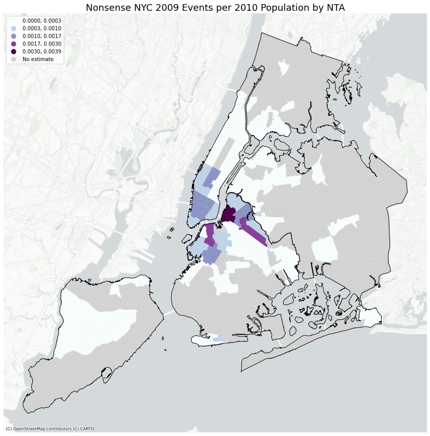
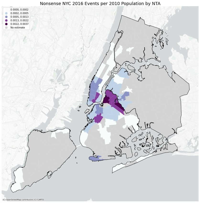
My first two maps were obtained by doing a spatial join of event addresses in 2009 and 2016 to NTAs, a geographic unit that approximates NYC’s neighborhoods while following census boundaries. I obtained data on each NTA’s population in the 2010 census, the decennial census between the two study years. I removed any NTA with a population under 2,000, since those NTAs tended to mostly consist of parkland and would skew the results. I then normalized the number of events per NTA by the total population of the NTA and shaded the data accordingly.
The maps show that while Williamsburg, Brooklyn, was the neighborhood with the most events per population in 2009 (darkest shade of purple on the map), by 2016, Bushwick to its southeast was giving it a run for its money, with Greenpoint to the north not far behind. Together, these adjacent neighborhoods had expanded North Brooklyn’s hold on NYC’s underground scene – at least the particular underground scene documented by Nonsense. Further south, DUMBO seemed to have lost its attraction, while Park Slope-Gowanus had taken up some of the slack. In western Queens too, things were starting to pick up steam in 2016 from barely any activity in 2009.
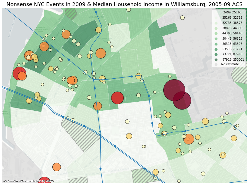
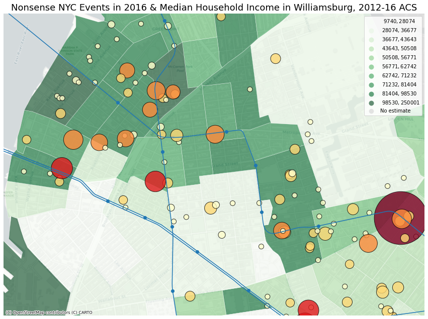
Changes in Williamsburg/East Williamsburg
This was a turbulent time in North Brooklyn. A massive rezoning in 2005 by the Bloomberg administration had opened the Williamsburg waterfront up for development, and between 2009 and 2016, the effect was starting to be seen. Zooming in on Williamsburg and East Williamsburg (which old timers insist is actually part of Bushwick), we see that income in the area had risen overall; darker green indicates movement into a higher decile of the city’s income distribution, with areas near the waterfront in the Northside and Southside becoming decisively high income. Correspondingly, low-rent venues left these areas. The size and color of circles on the maps below are proportional to the number of events featured in Nonsense NYC each year, and we see them receding inland from the waterfront, if only a few blocks. They have not necessarily moved to places with a lower median income – the relationship between money and the arts has rarely been straightforward, and the new venues that emerged may have had a different funding structure. In any case, venues like Death by Audio and Glasslands Gallery had been replaced by glassy towers along Kent Ave.
Another big change was the loss of Third Ward and the second location of House of Yes, the two largest circles on the 2009 map, which shared a census tract in East Williamsburg and appeared in Nonsense 38 and 55 times in 2009 respectively. We can see that by 2016, their tract had significantly grown in median income, likely precipitating their closure. Yet they were replaced by an even bigger circle further east into Bushwick along the L train in 2016 – the new House of Yes, which appeared 111 times in Nonsense that year! The center of the underground scene had shifted outwards.
Heavy hitters have their ups and downs
As per the previous section, some locations made many appearances in each year’s mailing list. Although House of Yes appeared far more than any other location, there were 22 locations in 2009 and 29 locations in 2016 that appeared at least 10 times in the mailing list – let’s call them the heavy hitters. The 2009 heavy hitters were responsible for 413 (29.1%) of the 1417 shows that year, despite representing only 1.6% of the addresses advertised. The 2016 heavy hitters were responsible for 554 (34.9%) of the 1587 shows in 2016, despite representing only 1.8% of locations.
Only about a third of the heavy hitters in 2009 appeared in the 2016 mailing list at all and vice versa. Only 2 venues appeared at least 10 times in both years, The Bell House and Union Hall. It’s an ephemeral scene.
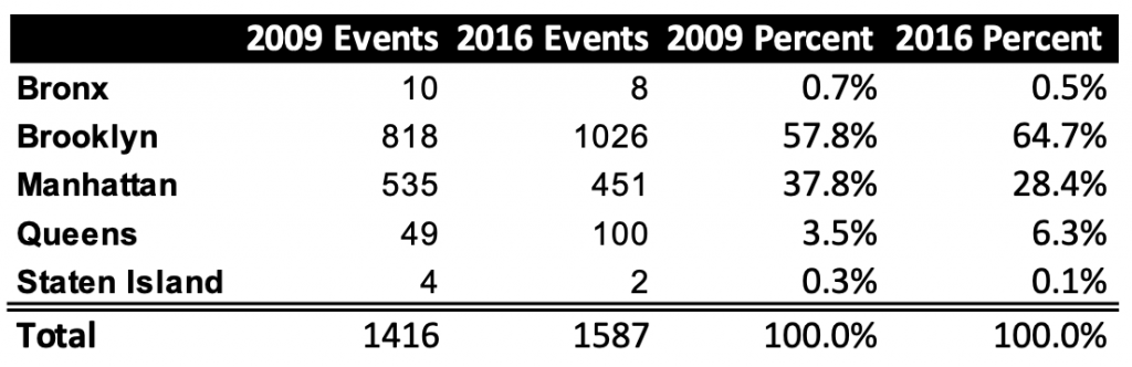
The boroughs had their ups and downs as well. Between 2009 and 2016, in addition to neighborhood-level changes, there were an increasing number of events in Brooklyn and Queens, and a declining number in Manhattan. But it could always go back the other way…apparently House of Yes has recently opened a new outpost on the Lower East Side.
Interactive map
There’s a lot more to explore and you can use this interactive map to get some sense of it. The map works better on desktop than mobile – if you’re on a small screen, you may want to put it in landscape mode to see the map’s menu. Click the circles to find an address that appeared in the newsletter, the number of advertised events at the location, and data on median income in the census tract. The size of the circle corresponds to how many events took place there. White circles represent addresses that appeared in both years. In the menu at upper right, toggle between 2009 and 2016 events, access satellite view, and show or hide the neighborhoods (which you can also click on) or subway system.
Should you enjoy such a thing, you can view the interactive map on a standalone page here.
Just for show
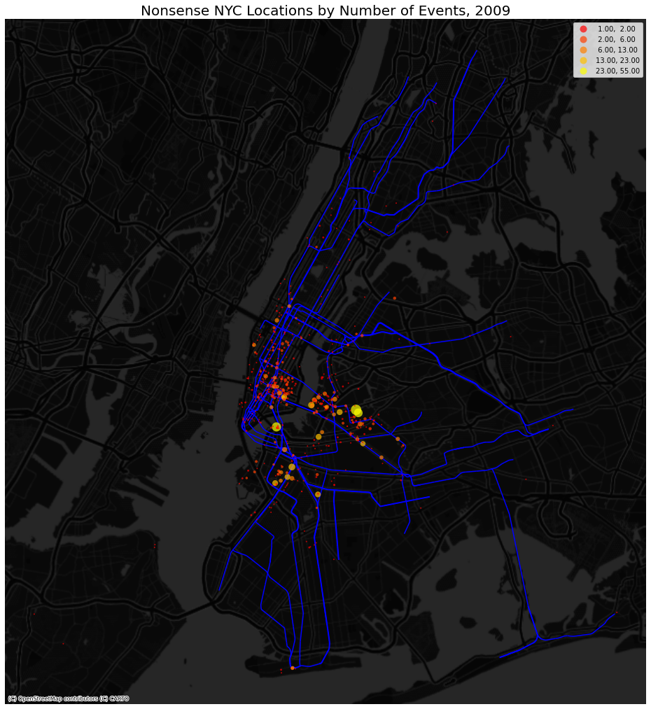
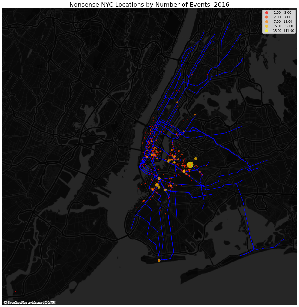
I’ve included two more static maps showing events in both years with subway lines because I think they’re pretty!
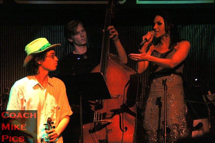
Finally, here’s me performing at House of Yes’s 2nd location on Maujer St back in 2011. I was singing and playing violin as a guy who didn’t want to kill a cockroach for moral reasons. Lisa on the right was singing as my girlfriend who was mad at me about it. Then a guy in a giant cockroach costume comes in and sings about how randy and free he is, while the orchestra and aerialists do their thing. Sounds like a lot of Nonsense to me.